M1
Information Architecture
Reimagining the structure of a $6B AUM unicorn.
UX Design
Web + Mobile
Scalable System
Role
Design Lead, Co-Project Lead
Responsibilities
Information Architecture, UX Research, Design System Documentation
Collaborators
C-Suite Stakeholders, PM (multiple), Compliance, Test Eng, Engineering, Design System, Visual Design
Timeline
6 months
Summary
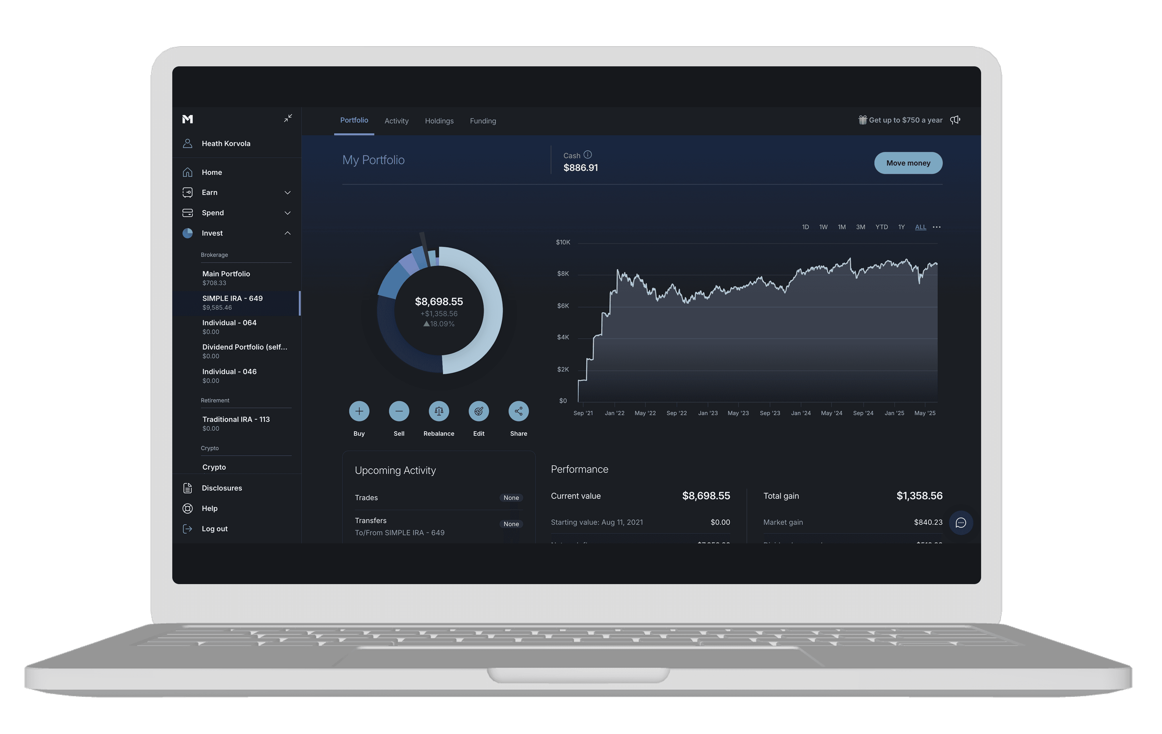
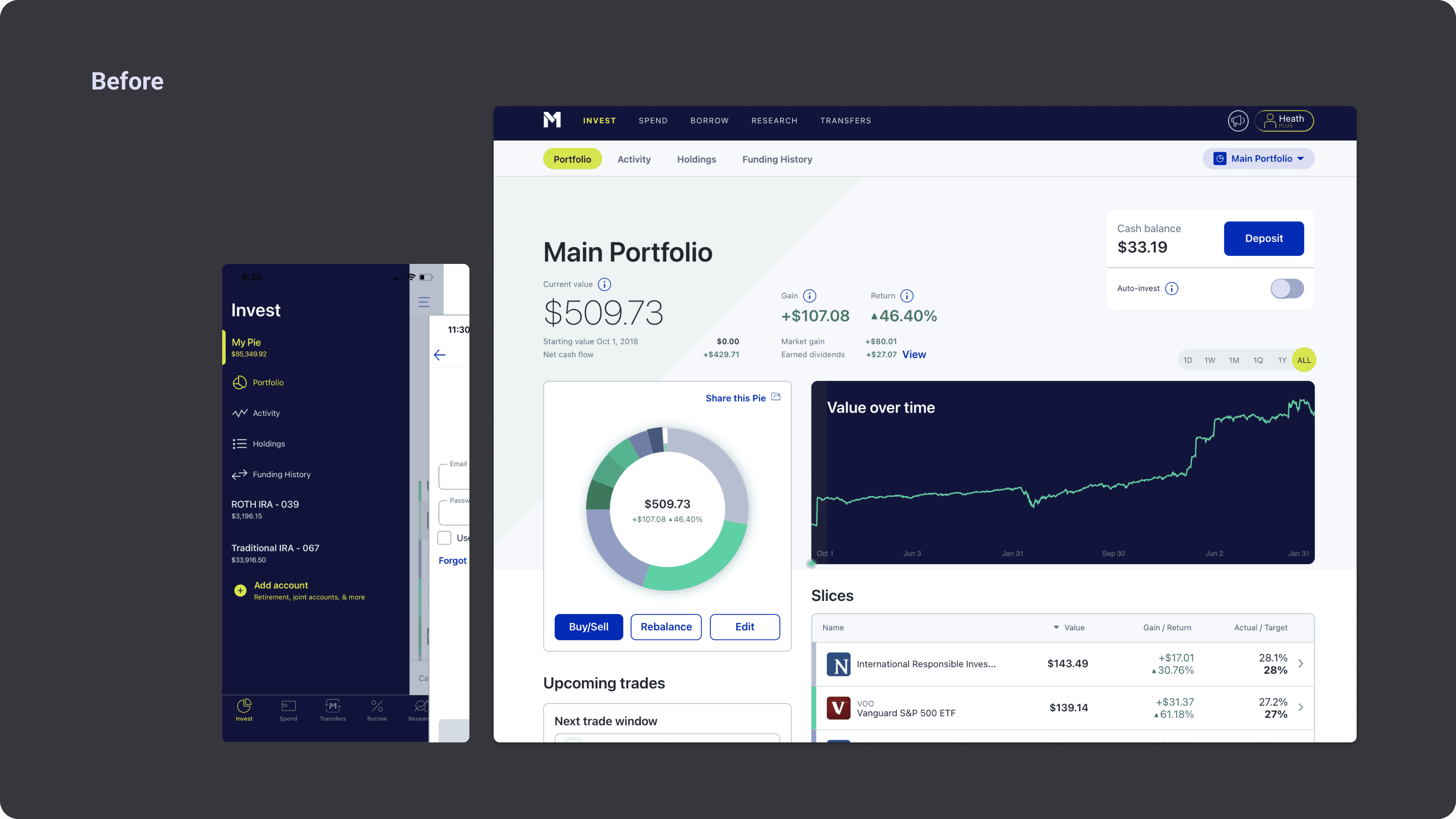
Reimagining the information architecture of M1, "the financial super app", managing over $6B in assets. The original M1 5 year plan was 7 years old + was failing on multiple levels - user, internal + business. Working across the entire organization I collaborated with the CEO/founder to intelligently rebuild the foundation for M1's growth + future success.
Goals:
Enhance user navigation to support growth.
Simplify complex financial data presentation to increase stickiness.
Optimize the overall user experience in the form of expanding the design system with updated components.
*This UX work was done in conjunction with a visual design uplift by the team of Ceasar Gamulja + Ricky Sunay. Mobile work assist by Victoria German.
$3B
AUM growth supported by architecture over following year
+7%
DAU growth over two months
2
New navigation components added to the design system.
Challenges
This high-visibility project came with unique complexities: redesigning M1's information architecture while maintaining user trust and engagement in a traditionally conservative industry, collaborating with the CEO/founder who reached out directly to me to lead this project (adding both opportunity and responsibility to deliver exceptional results), and balancing data-rich content with intuitive design.
Core Design Challenges
Preserving user confidence during a significant architectural shift
Balancing dense financial data with intuitive user experience
Orchestrating tight cross-functional collaboration across multiple teams
Working closely with our Design System Committee to establish scalable patterns and ensure consistent adoption across all platforms
"The app is kind of all over the place."
User MK
Process + Methodology
Strategic Foundation
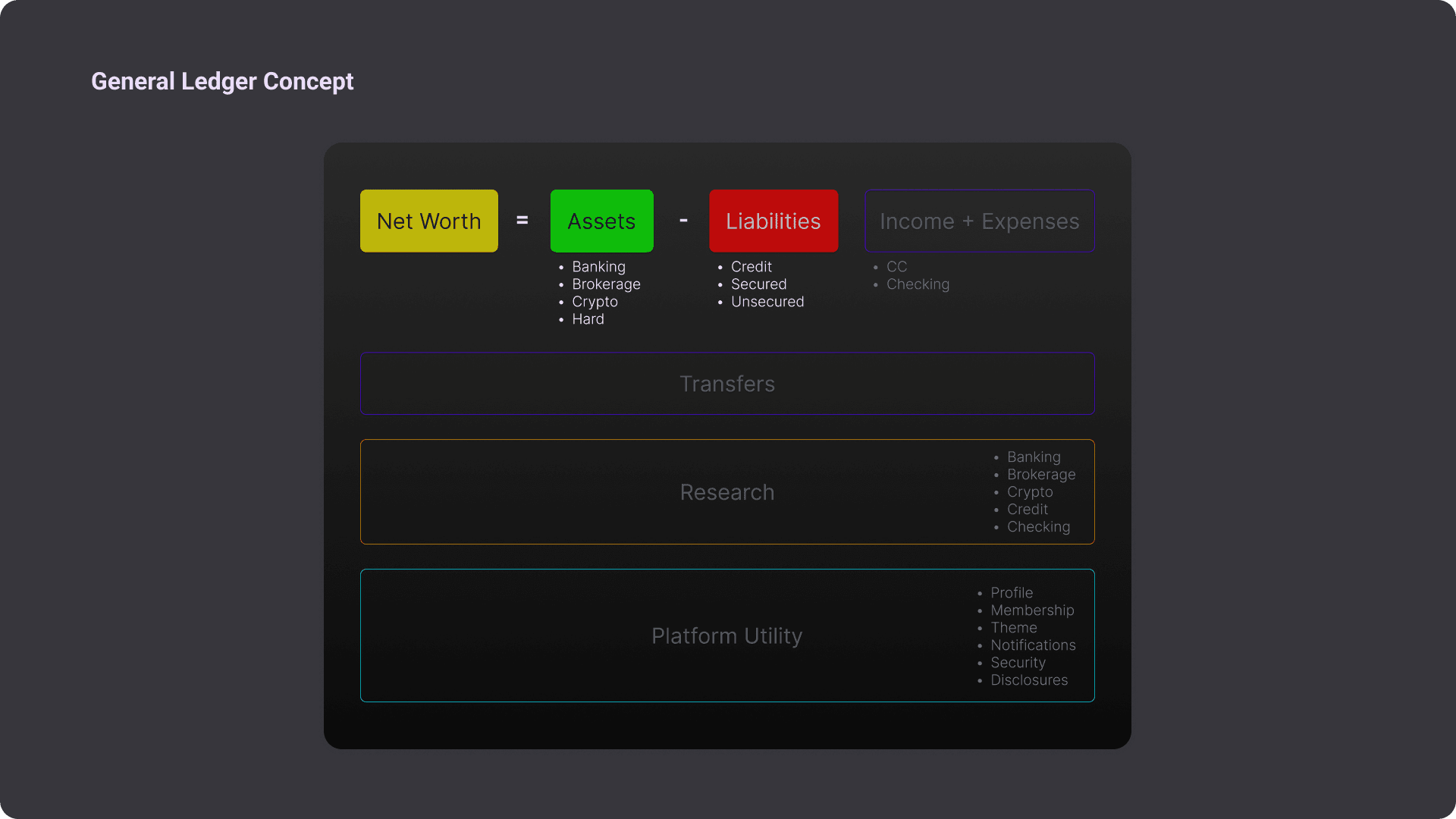
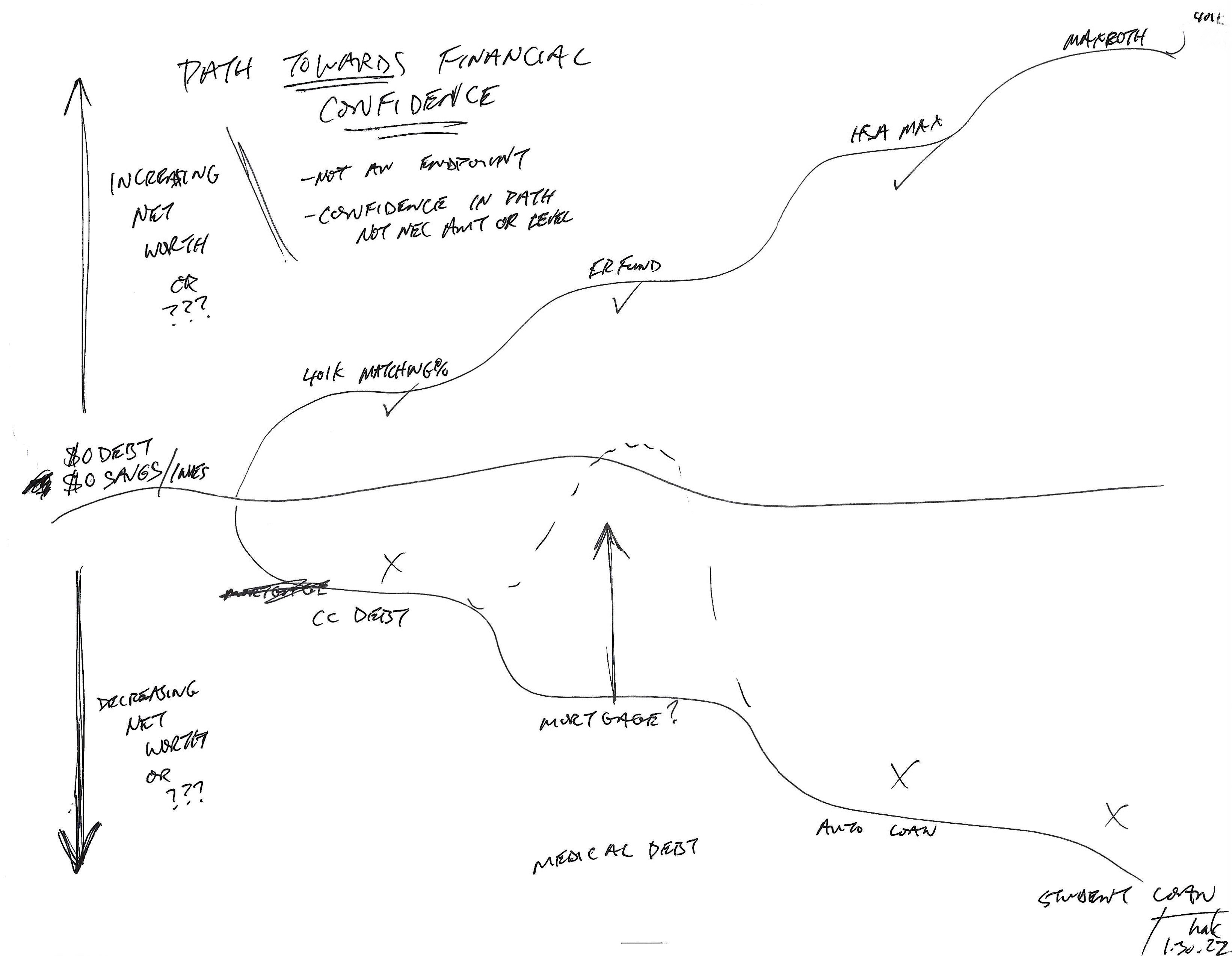
CEO Brian Barnes and I began by exploring his vision to center M1 around the Business Ledger—a fundamental accounting principle that calculates net worth as the sum of assets and liabilities. This foundational concept provided a robust framework for mapping M1's future product ecosystem and informed every subsequent design decision.
Design Process
My approach followed a systematic methodology:
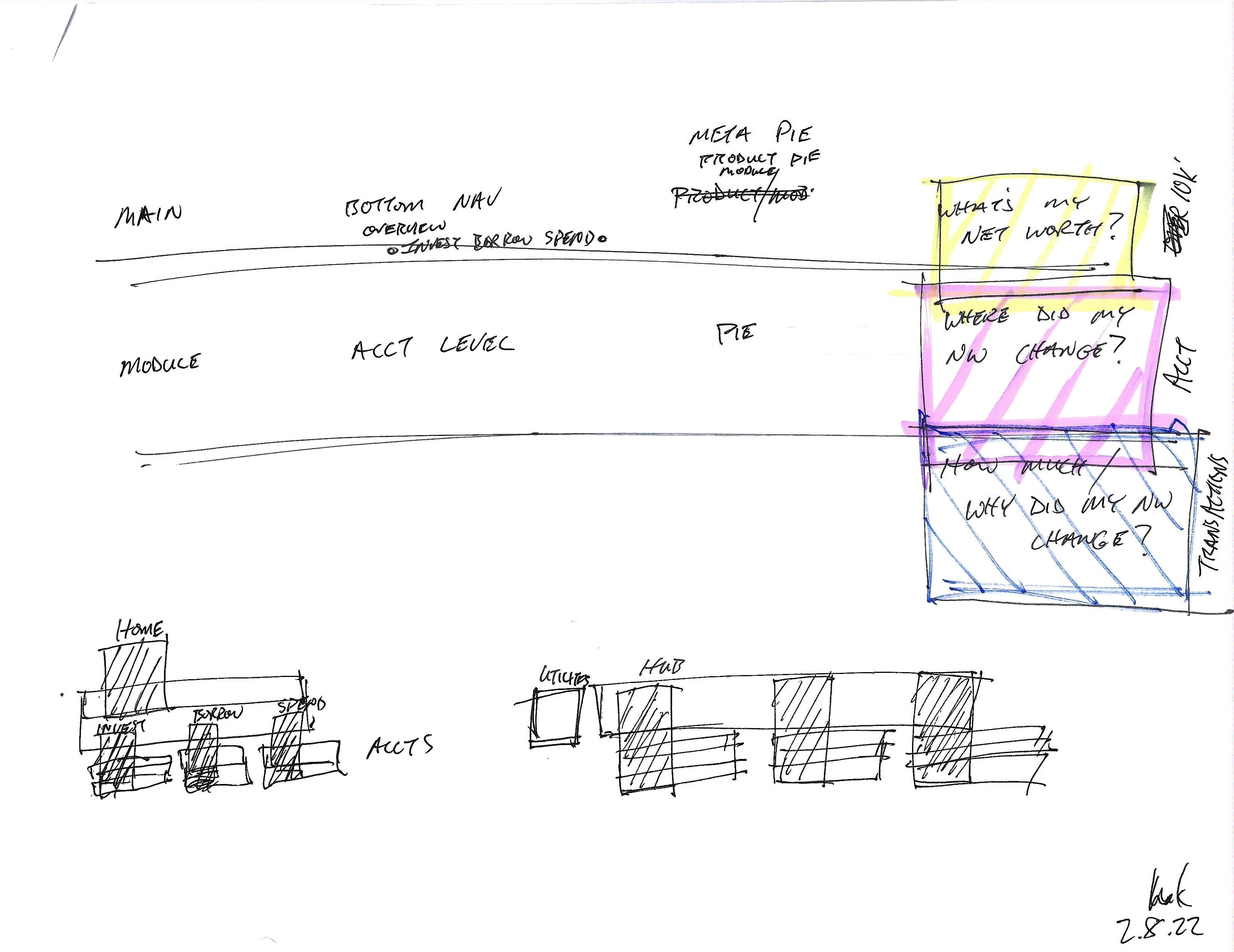
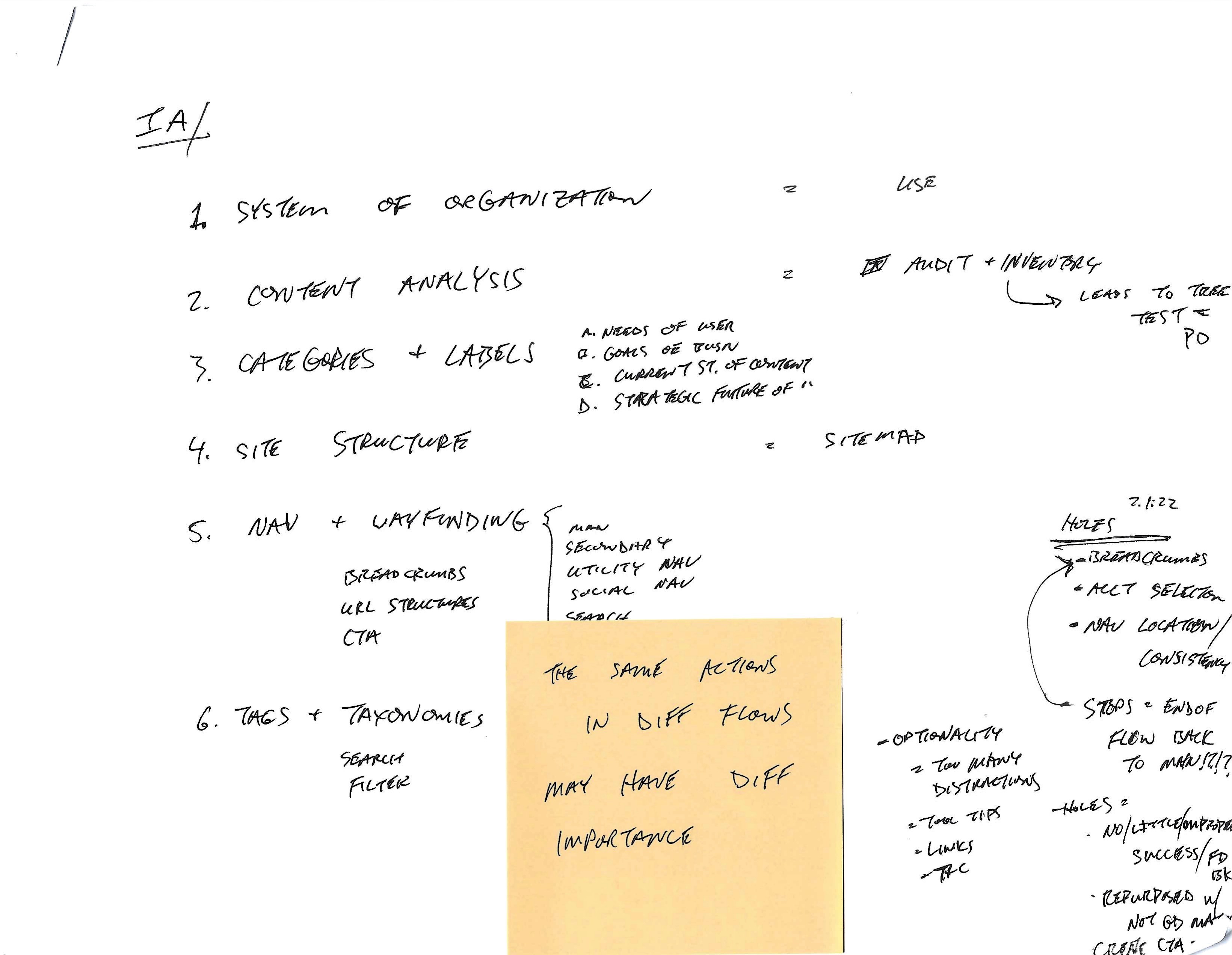
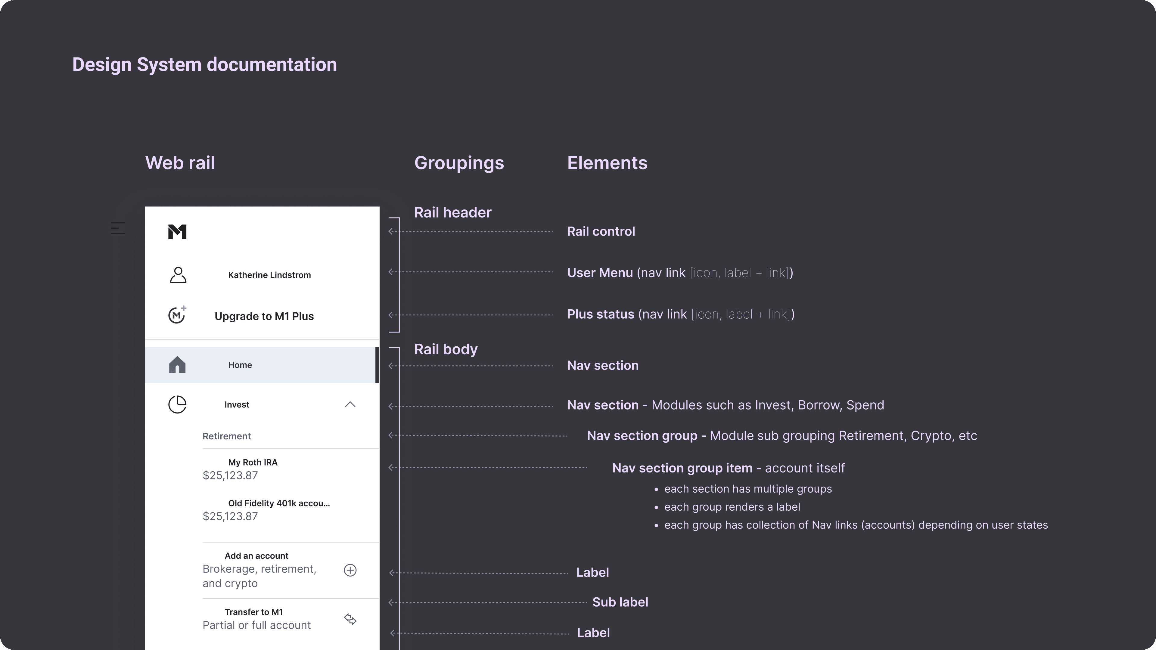
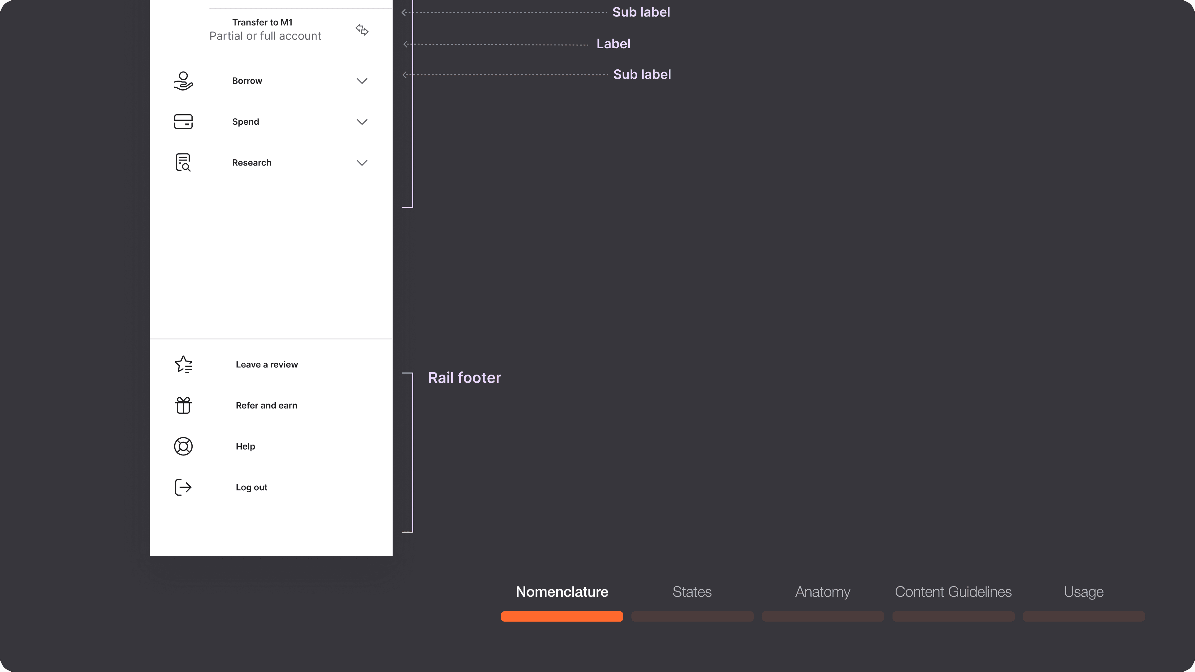
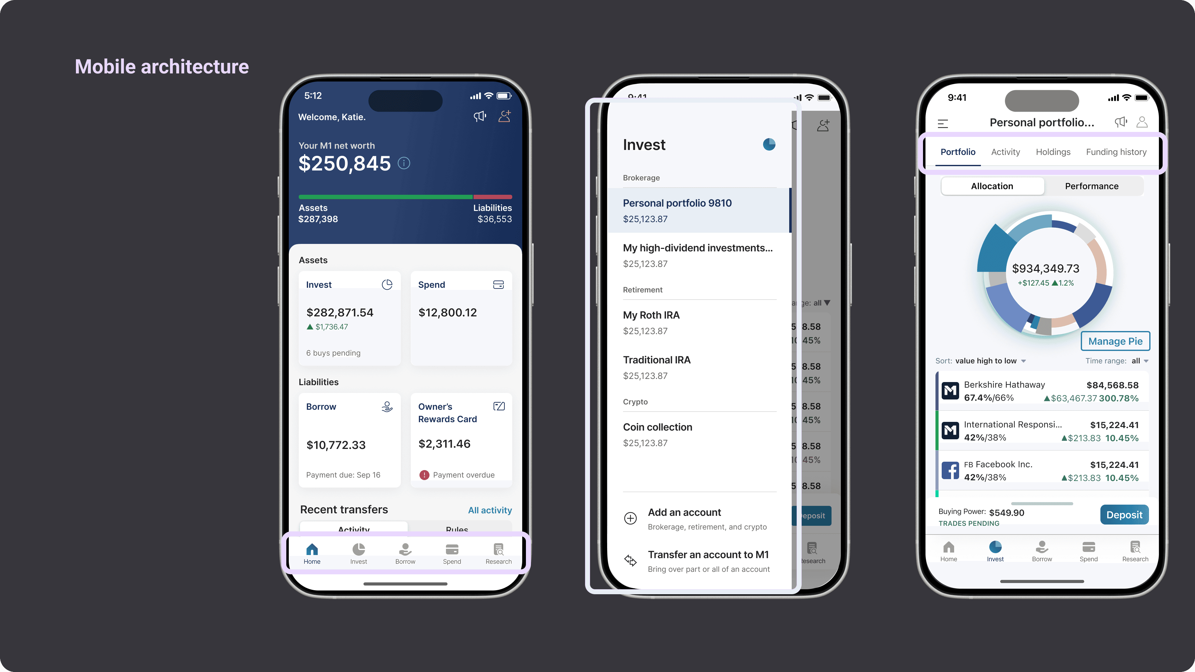
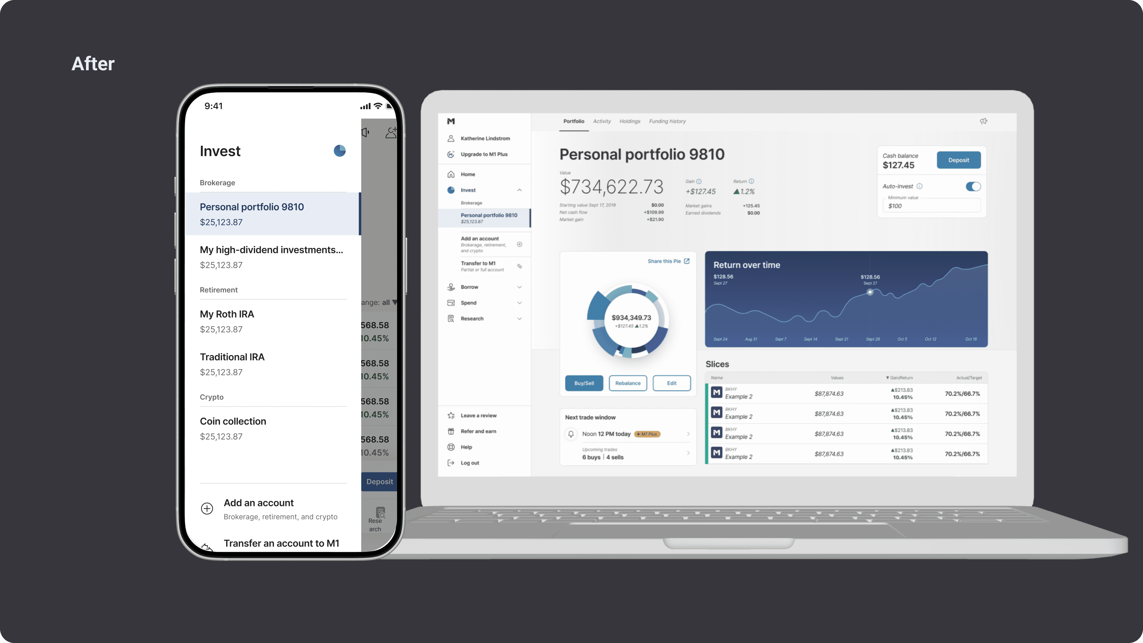
Discovery & Architecture: Conducted comprehensive site map inventory and information architecture analysis to understand the current state and identify optimization opportunities.
Ideation & Exploration: Generated divergent concept explorations and navigation alternatives, ensuring we considered multiple approaches before converging on the optimal solution.
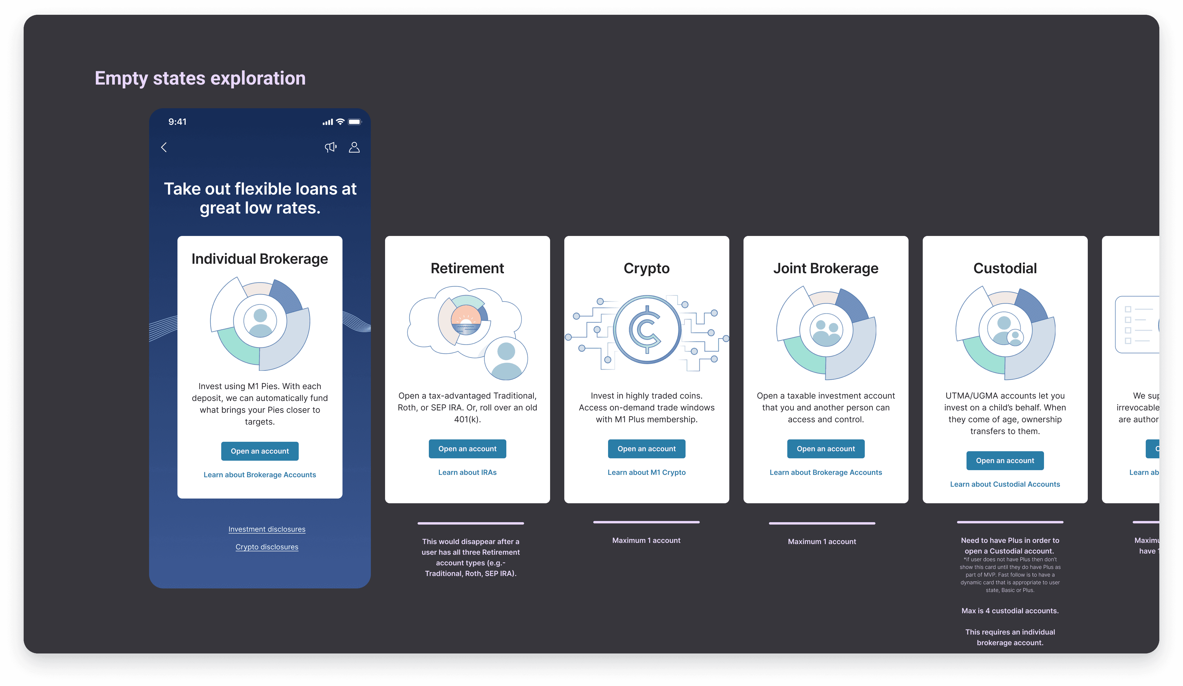
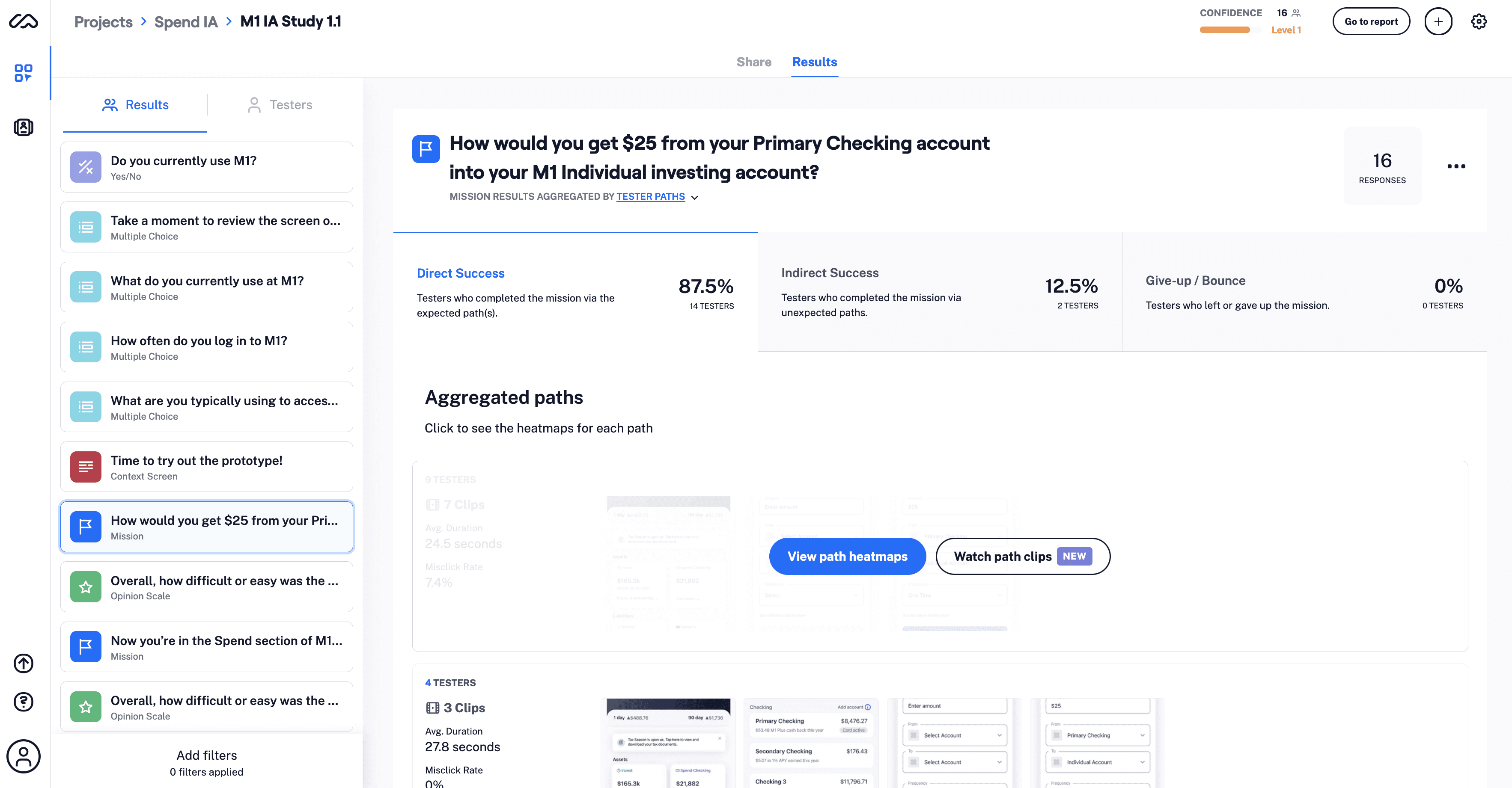
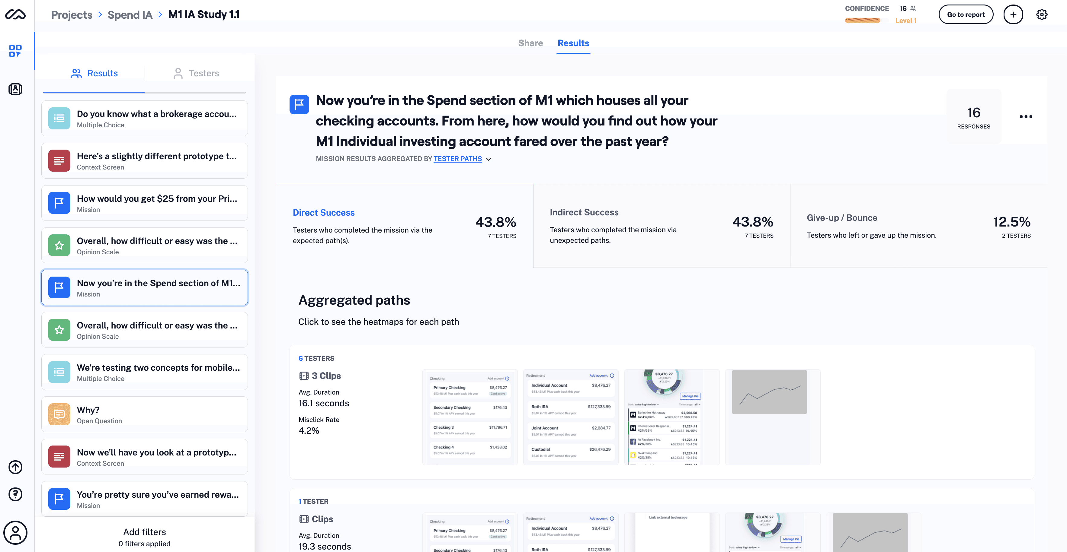
Validation & Refinement: Progressed from initial concepts through user testing on mockups, iterating based on feedback to validate our design decisions with real user insights.
Delivery & Documentation: Created a comprehensive delivery package including interactive Figma prototypes, detailed Design System documentation, and executive summary materials.
Cross-Organizational Alignment Working closely with my PM partner, I produced a video walkthrough that communicated both the project methodology and outcomes to stakeholders across the organization. This ensured company-wide understanding of the strategic rationale, design decisions, and expected impact.

Outcome
The outcomes of this project were really powerful on many levels. First off, user feedback. Secondly, for the business. Lastly, one that offered a surprise - scalability.
User Feedback
From comments around misleading navigation + wayfinding to the ultimate feedback, especially from a Reddit AMA, of "kudos to your designers".
Business goals
Couple of levels. Big one for the org was always around increasing AUM. In the year following this work the AUM of M1 rose from $6B to over $9B, not entirely attributable to this alone but definitely complimentary to the clearer user understanding. Additionally on the business side we saw a nice bump in DAU over two months post release.
Scalability
We often consider scalability in a growth mind set + understandably so. This project, as one would expect with IA, accounted for + accomplished that as evidenced by my team soon after releasing net new products that easily integrated with the Business Ledger concept as well as the navigation in place. The surprise, + lesser considered element of scalability, is in deprecated products. While unknown at the time of this IA project, the business later had need to deprecate the Checking Account product. That drop was easily accomplished on the UI side with the upgrades in navigation + wayfinding that this team successfully implemented as part of this project. A unique yet fulfilling experience proving the value of long term systems thinking to handle yet unknown vectors.
$3B
AUM growth supported by architecture over following year
+7%
DAU growth over two months
2
New navigation components added to the design system.
The Human-Centered Approach
I saw an opportunity to inject much-needed delight into the user experience. Guided by the principle of "emotional over transactional," I advocated for including motion design—particularly on mobile—to create moments of joy within complex financial workflows. Working alongside tech leads like Patrick McCarron we transformed cold data windows into dynamic experiences creating an interface that serves people first, complexity second.

M1
Information Architecture
Reimagining the structure of a $6B AUM unicorn.
UX Design
Web + Mobile
Scalable System
Role
Design Lead, Co-Project Lead
Responsibilities
Information Architecture, UX Research, Design System Documentation
Collaborators
C-Suite Stakeholders, PM (multiple), Compliance, Test Eng, Engineering, Design System, Visual Design
Timeline
6 months
Summary
Reimagining the information architecture of M1, "the financial super app", managing over $6B in assets. The original M1 5 year plan was 7 years old + was failing on multiple levels - user, internal + business. Working across the entire organization I collaborated with the CEO/founder to intelligently rebuild the foundation for M1's growth + future success.
Goals:
Enhance user navigation to support growth.
Simplify complex financial data presentation to increase stickiness.
Optimize the overall user experience in the form of expanding the design system with updated components.
*This UX work was done in conjunction with a visual design uplift by the team of Ceasar Gamulja + Ricky Sunay. Mobile work assist by Victoria German.
$3B
AUM growth supported by architecture over following year
+7%
DAU growth over two months
2
New navigation components added to the design system.
Challenges
This high-visibility project came with unique complexities: redesigning M1's information architecture while maintaining user trust and engagement in a traditionally conservative industry, collaborating with the CEO/founder who reached out directly to me to lead this project (adding both opportunity and responsibility to deliver exceptional results), and balancing data-rich content with intuitive design.
Core Design Challenges
Preserving user confidence during a significant architectural shift
Balancing dense financial data with intuitive user experience
Orchestrating tight cross-functional collaboration across multiple teams
Working closely with our Design System Committee to establish scalable patterns and ensure consistent adoption across all platforms
"The app is kind of all over the place."
User MK
Process + Methodology
Strategic Foundation
CEO Brian Barnes and I began by exploring his vision to center M1 around the Business Ledger—a fundamental accounting principle that calculates net worth as the sum of assets and liabilities. This foundational concept provided a robust framework for mapping M1's future product ecosystem and informed every subsequent design decision.
Design Process
My approach followed a systematic methodology:
Discovery & Architecture: Conducted comprehensive site map inventory and information architecture analysis to understand the current state and identify optimization opportunities.
Ideation & Exploration: Generated divergent concept explorations and navigation alternatives, ensuring we considered multiple approaches before converging on the optimal solution.
Validation & Refinement: Progressed from initial concepts through user testing on mockups, iterating based on feedback to validate our design decisions with real user insights.
Delivery & Documentation: Created a comprehensive delivery package including interactive Figma prototypes, detailed Design System documentation, and executive summary materials.
Cross-Organizational Alignment Working closely with my PM partner, I produced a video walkthrough that communicated both the project methodology and outcomes to stakeholders across the organization. This ensured company-wide understanding of the strategic rationale, design decisions, and expected impact.
Outcome
The outcomes of this project were really powerful on many levels. First off, user feedback. Secondly, for the business. Lastly, one that offered a surprise - scalability.
User Feedback
From comments around misleading navigation + wayfinding to the ultimate feedback, especially from a Reddit AMA, of "kudos to your designers".
Business goals
Couple of levels. Big one for the org was always around increasing AUM. In the year following this work the AUM of M1 rose from $6B to over $9B, not entirely attributable to this alone but definitely complimentary to the clearer user understanding. Additionally on the business side we saw a nice bump in DAU over two months post release.
Scalability
We often consider scalability in a growth mind set + understandably so. This project, as one would expect with IA, accounted for + accomplished that as evidenced by my team soon after releasing net new products that easily integrated with the Business Ledger concept as well as the navigation in place. The surprise, + lesser considered element of scalability, is in deprecated products. While unknown at the time of this IA project, the business later had need to deprecate the Checking Account product. That drop was easily accomplished on the UI side with the upgrades in navigation + wayfinding that this team successfully implemented as part of this project. A unique yet fulfilling experience proving the value of long term systems thinking to handle yet unknown vectors.
$3B
AUM growth supported by architecture over following year
+7%
DAU growth over two months
2
New navigation components added to the design system.
The Human-Centered Approach
I saw an opportunity to inject much-needed delight into the user experience. Guided by the principle of "emotional over transactional," I advocated for including motion design—particularly on mobile—to create moments of joy within complex financial workflows. Working alongside tech leads like Patrick McCarron we transformed cold data windows into dynamic experiences creating an interface that serves people first, complexity second.
M1
Information Architecture
Reimagining the structure of a $6B AUM unicorn.
UX Design
Web + Mobile
Scalable System
Role
Design Lead, Co-Project Lead
Responsibilities
Information Architecture, UX Research, Design System Documentation
Collaborators
C-Suite Stakeholders, PM (multiple), Compliance, Test Eng, Engineering, Design System, Visual Design
Timeline
6 months
Summary
Reimagining the information architecture of M1, "the financial super app", managing over $6B in assets. The original M1 5 year plan was 7 years old + was failing on multiple levels - user, internal + business. Working across the entire organization I collaborated with the CEO/founder to intelligently rebuild the foundation for M1's growth + future success.
Goals:
Enhance user navigation to support growth.
Simplify complex financial data presentation to increase stickiness.
Optimize the overall user experience in the form of expanding the design system with updated components.
*This UX work was done in conjunction with a visual design uplift by the team of Ceasar Gamulja + Ricky Sunay. Mobile work assist by Victoria German.
$3B
AUM growth supported by architecture over following
year
+7%
DAU growth over two months
2
New navigation components added to the design system.
Challenges
This high-visibility project came with unique complexities: redesigning M1's information architecture while maintaining user trust and engagement in a traditionally conservative industry, collaborating with the CEO/founder who reached out directly to me to lead this project (adding both opportunity and responsibility to deliver exceptional results), and balancing data-rich content with intuitive design.
Core Design Challenges
Preserving user confidence during a significant architectural shift
Balancing dense financial data with intuitive user experience
Orchestrating tight cross-functional collaboration across multiple teams
Working closely with our Design System Committee to establish scalable patterns and ensure consistent adoption across all platforms
"The app is kind of all over the place."
User MK
Process
Strategic Foundation
CEO Brian Barnes and I began by exploring his vision to center M1 around the Business Ledger—a fundamental accounting principle that calculates net worth as the sum of assets and liabilities. This foundational concept provided a robust framework for mapping M1's future product ecosystem and informed every subsequent design decision.
Design Process
My approach followed a systematic methodology:
Discovery & Architecture: Conducted comprehensive site map inventory and information architecture analysis to understand the current state and identify optimization opportunities.
Ideation & Exploration: Generated divergent concept explorations and navigation alternatives, ensuring we considered multiple approaches before converging on the optimal solution.
Validation & Refinement: Progressed from initial concepts through user testing on mockups, iterating based on feedback to validate our design decisions with real user insights.
Delivery & Documentation: Created a comprehensive delivery package including interactive Figma prototypes, detailed Design System documentation, and executive summary materials.
Cross-Organizational Alignment Working closely with my PM partner, I produced a video walkthrough that communicated both the project methodology and outcomes to stakeholders across the organization. This ensured company-wide understanding of the strategic rationale, design decisions, and expected impact.
Outcome
The outcomes of this project were really powerful on many levels. First off, user feedback. Secondly, for the business. Lastly, one that offered a surprise - scalability.
User Feedback
From comments around misleading navigation + wayfinding to the ultimate feedback, especially from a Reddit AMA, of "kudos to your designers".
Business goals
Couple of levels. Big one for the org was always around increasing AUM. In the year following this work the AUM of M1 rose from $6B to over $9B, not entirely attributable to this alone but definitely complimentary to the clearer user understanding. Additionally on the business side we saw a nice bump in DAU over two months post release.
Scalability
We often consider scalability in a growth mind set + understandably so. This project, as one would expect with IA, accounted for + accomplished that as evidenced by my team soon after releasing net new products that easily integrated with the Business Ledger concept as well as the navigation in place. The surprise, + lesser considered element of scalability, is in deprecated products. While unknown at the time of this IA project, the business later had need to deprecate the Checking Account product. That drop was easily accomplished on the UI side with the upgrades in navigation + wayfinding that this team successfully implemented as part of this project. A unique yet fulfilling experience proving the value of long term systems thinking to handle yet unknown vectors.
$3B
AUM growth supported by architecture over following year
+7%
DAU growth over two months
2
New navigation components added to the design system.
The Human-Centered Approach
I saw an opportunity to inject much-needed delight into the user experience. Guided by the principle of "emotional over transactional," I advocated for including motion design—particularly on mobile—to create moments of joy within complex financial workflows. Working alongside tech leads like Patrick McCarron we transformed cold data windows into dynamic experiences creating an interface that serves people first, complexity second.